London 2012
Submitted by coofercat on Wed, 2007-06-06 07:57
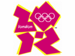
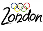 There's quite a bit of chat going on about this at the moment. The London 2012 Olympic logo (on the left) has had it's fair share of critcism (as is an advert). The BBC are showing contributed logos, my favourite on the right.
I don't suppose any logo would be universally popular. I'd sort have expected it to have "just crept in" without quite so much media coverage. Apparently it's flexible and will evolve. Keep 'em peeled ;-)
Comments
Doesn't the London 2012 logo look a bit like Zordon? Remember him? That weird head in a tube from the "Power Rangers?" Umm... Not that I watched that or anything. I'm just sayin...
The (so called) Olympic symbol is infact just design thought up by the NAZI party before the 1936 Berlin games.
So if even if you do kill 12 million people, people don't care.. good art is good art.
Nothing can save this logo.. nothing.
Looks a bit like Lisa Simpson doing something illegal to her brother.